A PRACTICAL GUIDE
Make AI images
feel more real.
Give generated images a photographic finish with subtle lens softness, sensor texture and natural colour.
Separate scene realism from surface finish.
Follow the light across the whole frame. A window, cast shadow and reflection should tell a consistent story. Check furniture scale and converging edges. An attractive colour treatment cannot correct incompatible shadows or an object that changes shape; return to your generator or editing tool for those repairs.
Start with a convincing source
Choose a generated image with plausible lighting, anatomy and perspective. Camera simulation can change its finish, but cannot correct an impossible scene.
Adjust the natural finish
Natural offers balanced colours, softer edges and visible grain. Adjust the intensity to suit your image.
Review before publishing
Inspect faces, hands, lettering and edges. Keep appropriate disclosure of the image’s origin. A photographic finish is a creative treatment, not proof of a camera capture.
Use the interior as a worked example.
At 70% intensity, the interior sample loses some vivid colour and gains texture in the darker furniture. The room layout does not change. Compare bright walls against the sofa: keep enough separation to read the materials. For a clean architectural presentation, a gentler treatment may suit the image better.
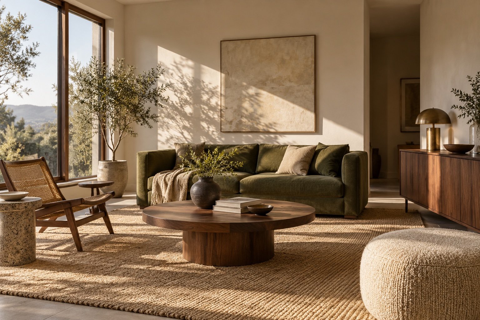 Original image
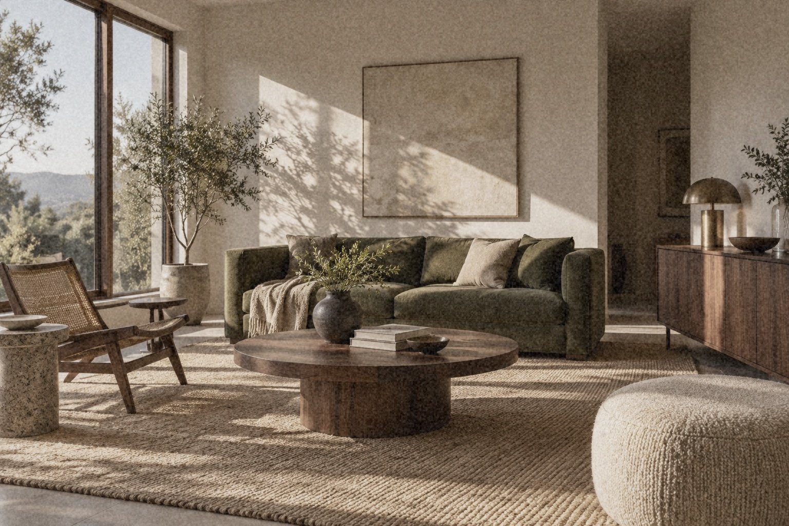 Natural · 70%
Review your publishing context.
For a moodboard, prioritise the overall impression. For a product listing or property advertisement, factual accuracy matters more than a photographic finish. Check materials, dimensions and the actual subject, and disclose generated imagery when appropriate. Save the original and review the final crop before sharing.